Spatial Relationship between Air Quality and the Presence of Cattle Production
Abstract
Modern agriculture in the United States has continually evolved in order to meet the high demand of a growing population. This constant expansion has become a problem in recent years because the increasing production is not environmentally sustainable. Studies have shown that the high rate of beef consumption has become one of the largest drivers of food-borne greenhouse gas emissions, water use and land occupation (Goldstein et al., 2017). Given that beef production has increased so highly to meet the growing demand, we have begun polluting the environment with Particulate Matter (PM) at an exponential rate. The study area for this project will focus on the top three counties with the highest/lowest production value of cattle based commodity; the highest production value has been identified as Tulare, Kern, and Merced county; the lowest production value has been identified as Modoc, Plumas, and Butte. This study will utilize Geographic Information Systems (GIS) in order to perform a statistical analysis of the impacts that cattle production is having on air quality in California. This study has identified a correlation between the presence of cattle and the levels of PM that is present in the air. However, there are additional factors that are not taken into account including human impact, other agricultural commodities, and wind patterns.
Keywords: California, Cattle, Air Quality, Particulate Matter
1. Hypothesis
1.1 Null Hypothesis
Counties throughout California that produce a high quantity of cattle are expected to have air quality that is the same as counties that do not.
1.2 Alternative Hypothesis
Counties throughout California that produce a high quantity of cattle are expected to have air quality that is worse than counties that do not.
2. Introduction
2.1 Value of Cattle
Cattle is one of the biggest agricultural commodities that can be found in the state of California. According to the California Department of Food and Agriculture, Cattle and Calves produced $3.63 billion in 2022. In addition, the CDFA reported $10.4 billion in milk and dairy products (California Department of Food and Agriculture, 2023). This is a growing problem due to the fact that cattle are drivers of pollution, specifically particulate matter.
2.2 Particulate Matter
Particulate Matter (PM) is a form of air pollution that can have serious side effects on the health of people living in areas of high concentration. PM has two main classifications, PM10 and PM2.5, which account for the size of the particle. “PM10 is particulate matter 10 micrometers or less in diameter, PM2.5 is particulate matter 2.5 micrometers or less in diameter”(Particulate matter, 2022). These particles are extremely fine which makes them very difficult to measure without satellite data gathering. These tiny particles contribute to the makeup of dust, which can be inhaled and become stuck in individuals lungs, nose, mouth, throat, or blood (Particulate matter, 2022). These particles can have toxic effects on the body which can lead to severe health concerns.
3. Methods
3.1 GIS
This study utilizes Geographic Information Systems (GIS), which is often defined as a collection of computer hardware, software, geographic data, and trained personnel that are able to manipulate, update, analyze, and display all forms of geographic data. Individuals trained to use GIS software are able to utilize geographical data in order to solve important questions about a wide range of topics. The methods of this study will include a variety of GIS tools, including Zonal Statistics, Nearest Neighbor, Getis-Ord Gi Hotspot Analysis, Global Moran’s I, and Spatial Association Between Zones.
3.2 Data
The data that was used in this study includes an air quality raster, a cropland data layer, the production value of cattle commodities at the county level, and a counties shapefile for the state of California. The air quality raster provides an index for the amount of Particulate Matter that is present in the air (Figure 1.). The cropland data layer is used to extract the grassland/pasture attribute, which displays areas that are capable of supporting the presence of cattle (Figure 2.). The counties shapefile is joined with the production value data in order to highlight which counties have the greatest production values (Figure 3.). With these datasets, I am able to select the counties with the greatest and lowest concentration of cattle and conduct a statistical analysis.
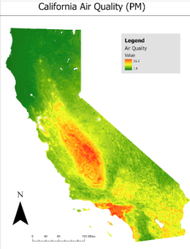
Figure 1. Displays the air quality throughout California based on the amount of particulate matter in the air.
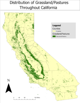
Figure 2. Displays the distribution of grassland/pastures throughout California.
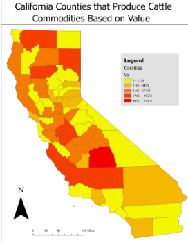
Figure 3. Displays the value of cattle based commodities at a county level.
3.3 GIS Analysis
Several GIS tasks were required in order to have the data in proper formatting. To start, the counties shapefile for California needed to be projected into the state plane coordinate system NAD 1983 California (Teale) Albers (US Feet). This allows the data to be properly projected and provides the most accurate results. This shapefile was then joined with the Excel Spreadsheet containing the cattle commodity value data, which had been downloaded from the USDA National Agricultural Statistics Service. The results of this join can be viewed in Figure 3.
The crop land data layer downloaded from the USDA National Agricultural Statistics Service represents agriculture throughout the entire United States. My first step for preparing this data was to extract by mask using a shapfile of California as the mask data. I then needed to extract by attribute to display only the grassland/pasture data. The Raster to Polygon tool was then used to create a grassland/pasture polygon for a later analysis.
The main tool utilized for this study, Spatial Association Between Zones, requires specific data formatting in order for the tool to run. I needed to create a fishnet for each of the target areas. Using the fishnets, I calculated the average air quality per cell by running Zonal Statistics. Then, I had to change the average air quality raster from pixel format to integer because of the required inputs. I also converted the raster to a polygon because the Spatial Association tool provides additional outputs when the data is a polygon.
To obtain accurate results and expedite processing time, each dataset needed to be clipped at the county level for each of the six study areas. This required a lot of additional extractions and clips but I found that it produced the most accurate representation of the data and results.
3.4 Statistical Analysis
There are a variety of statistical tools that were used in this analysis. A Getis-Ord Gi Hotspot Analysis was performed to identify which regions of California is are experiencing hot or cold spots based on the value of cattle commodity. This analysis helped identify the areas with the highest concentration of cattle. However, the analysis did not reveal any cold spots (Figure 4).
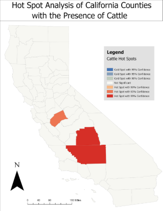
Figure 4. The hotspot analysis revealed the counties with the highest concentration of cattle. These three hot spot counties are also the top three producers of cattle commodities in terms of value.
The second tool used was Zonal Statistics, which can be used to “calculate statistics on values of a raster within the zones of another dataset”(Zonal Statistics). The statistics that are calculated are the mean value of air quality within the zones of each fishnet cell.
The third statistic tool utilzed in this study is the Average Nearest Neighbor, which “calculates a nearest neighbor index based on the average distance from each feature to its nearest neighboring feature”(Average nearest neighbor). Average Nearest Neighbor calculations were performed at each county using the grassland/pasture polygon that had been previously created.
Global Moran’s I is the fourth statistic tool used, which “measures spatial autocorrelation based on feature locations and attribute values using the Global Moran's I statistic”(Spatial autocorrelation). The feature being tested is the grassland/pasture polygon using the inverse distance, euclidean distance method, and row standardization options.
The final statistical tool used for this analysis is Spatial Association Between Zones. This tool measures the degree of spatial association between two regionalizations of the same study area in which each regionalization is composed of a set of categories, called zones. The association between the regionalizations is determined by the area overlap between zones of each regionalization. The association is highest when each zone of one regionalization closely corresponds to a zone of the other regionalization (Spatial association between zones). The regionalizations used are the mean air quality polygon and the grassland/pasture polygon, testing for the association between the two zones.
4. Results
4.1 Zonal Statistics
The use of the Zonal Statistic spatial analyst tool allowed me to obtain the average of air quality per fishnet cell. When overlaying the grassland/pasture dataset, we are able to see how the distribution of pastures is consistent with the average quality of air. We can see that in Tulare county, the presence of pastures is consistent with the amount of Particulate Matter that is in the air (Figure 5). Areas with the presence of pastures tend to have air quality in the range of 12-17, in terms of particulate matter. However, there are other contributing factor to PM which are not addressed. It is apparent that the presence of cattle is having an impact on the quality of air but something else is causing worse impacts in other areas.
The correspondence between air quality and presence of pastures is consistent Tulare and Kern county (Figure 6) . However, Merced county displayed different results. Merced was the third top producer of cattle related commodities so similar results were expected but were not presented. Merced showed a distribution of grassland and pastures throughout the county with two significant clusters. The southwest cluster is in an area represented by relatively clean air quality; while the northeast cluster is an area represented by relatively poor air quality. This could mean that the southwest cluster does not support cattle, or that additional influences are having an effect on the presence of PM in the air.
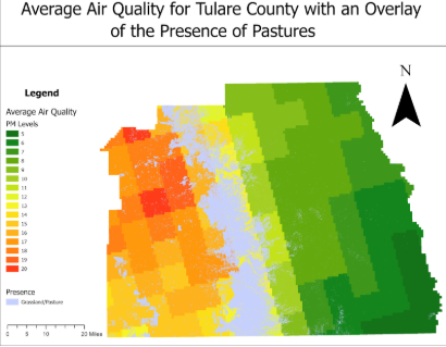
Figure 5. Representation of the average air quality for Tulare County being consistent in regions with grassland/pasture.
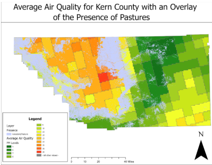
Figure 6. Representation of the average air quality for Kern County being consistent in regions with grassland/pasture.
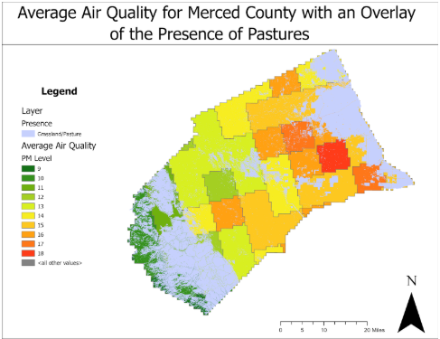
Figure 7. Representation of the average air quality for Merced County showing inconsistency between air quality and grassland/pastures.
4.2 Average Nearest Neighbor
Using the Average Nearest Neighbor tool allowed me to test the distribution pattern of the presence of grassland/pasture. These results showed extreme clustering of grassland/pastures in each county. Tulare county produced a z-score of -244.8 and a P-value of 0 (Figure 8). Kern county produced a z-score of -377.5 and a P-value of 0 (Figure 9). Mered county produced a z-score of -183.1 and a P-value of 0 (Figure 10). With the values of these z-scores and a p-values, we can infer that these results are statistically significant at a .01 level. The summary reports all states that there is a less than 1% likelihood that the clustering pattern observed could be a result of random chance.
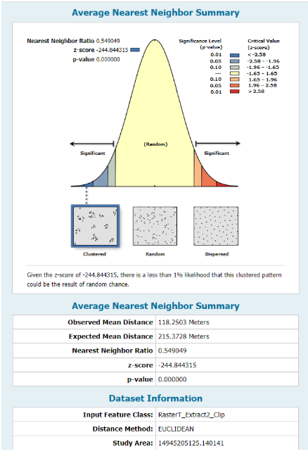
Figure 8. Near Neighbor Index for Tulare County grassland/pastures.

Figure 9. Near Neighbor Index for Kern County grassland/pastures.
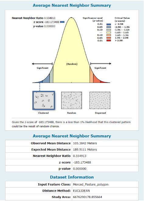
Figure 10. Near Neighbor Index for Merced County grassland/pastures.
4.3 Global Moran’s I
Moran’s I allows us to test for spatial autocorrelation to better understand if the proximity between two features has an effect on their value. Using the inverse distance squared option I was able to obtain z-score and I values for each of the target counties by testing the grassland/pastures variable. Tulare county produced a z-score of 2,399.8 and an I value of 0.9975 (Figure 11). Kern county produced a z-score of 5,820.6 and an I value of 0.9971 (Figure 12). Merced county produced a z-score of 1,843 and an I value of 0.9938 (Figure 13). The I values, which are greater than zero signify that extreme clustering is present.There is a very high probability that these results are meaningful based on the extremely high z-scores. This further strengthens the claim of clustering among grassland/pastures. The statistics confirm that there is spatial autocorrelation which means that grassland/pastures has an influence on it’s nearest neighbors.The autocorrelation reports all state that there is a less than 1% likelihood that the clustering pattern observed could be a result of random chance.
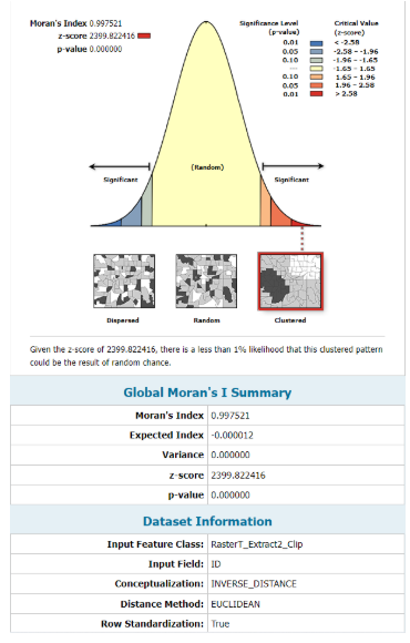
Figure 11. Spatial Autocorreltation Report for Tulare County grassland/pastures.
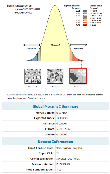
Figure 12. Spatial Autocorreltation Report for Kern County grassland/pastures.
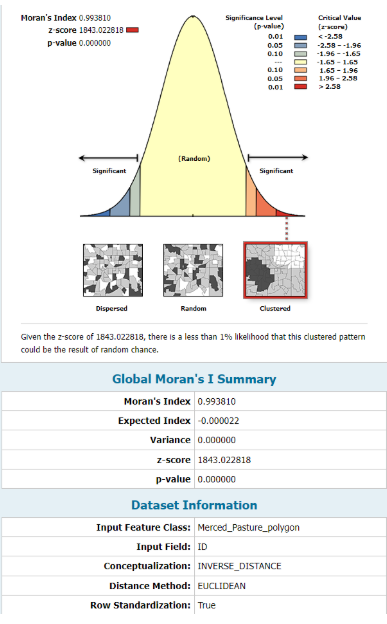
Figure 13. Spatial Autocorreltation Report for Merced County grassland/pastures.
4.4 Spatial Association Between Zones
Spaital Association Between Zones is the primary tool used for this analysis. The tool allows us to measure the degree of spatial association between two different datasets of the same region. This tool provides a variety of inputs and outputs, allowing you to test specific variable and how they are influencing eachother. The outputs consist of Correspondence of Overlay Zones within Input Zones and Correspondence of Input Zones within Overlay Zones. This provided a clear picture of which areas have the highest and lowest correspondence between the two datasets.
The analysis of Tulare (Figure 14) and Kern county (Figure 15) show that there is a significant correlation between the presence of grassland/pastures and the air quality of the same region. However, Merced county produced slightly different results, displaying less correlation between the two datasets. When this tool was used to test the correlation between these datasets in counties with the lowest production value of cattle commodities (Figures 17-19), it showed that there is little to no correlation present. I believe these results are significant enough to reject the null hypothesis and accept the alternative hypothesis.
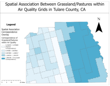
Figure 14. Displays the main output provided by Spatial Association Between Zones for Tulare County.
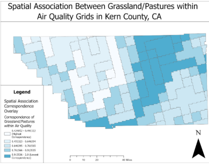
Figure 15. Displays the main output provided by Spatial Association Between Zones for Kern County.
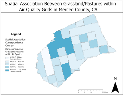
Figure 16. Displays the main output provided by Spatial Association Between Zones for Merced County.
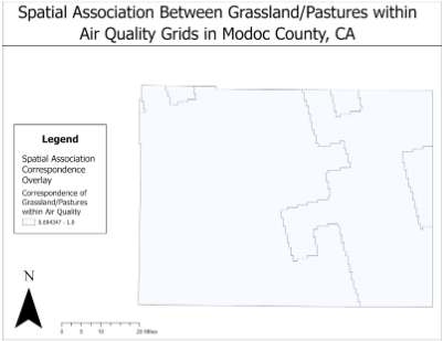
Figure 17. Displays the main output provided by Spatial Association Between Zones for Modoc County.
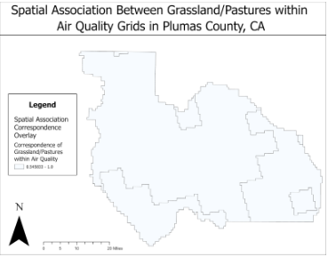
Figure 18. Displays the main output provided by Spatial Association Between Zones for Plumas County.
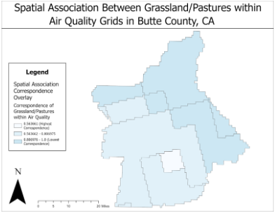
Figure 19. Displays the main output provided by Spatial Association Between Zones for Butte County.
5. Discussion
The original research question for this project was “Is air quality worse in areas with high amounts of cattle production, compared to areas without?” Throughout my analysis I have adapted this question to testing the correlation between air quality and the presence of cattle production. From my analysis, I have found that there is a correlation between air quality and the presence of cattle. We can see that the top cattle production counties (Figures 14, 15, and 16) all display a correlation between the presence of cattle and air quality; Tulare and Kern county have stronger correlation than Merced, but Merced still has some correlation. When we compare the results of the top three production counties with the bottom three production counties (Figures 17, 18, and 19) we can see that there is significantly less correlation that can be found. These bottom three counties have a cattle commodity production value of zero meaning there are not cattle present in these counties. I believe that the lack of correlation is due to the absence of the cattle, which increase the amount of PM in the air. I found that the clustering was also significant in terms of correlation because the strongest correlations between air quality grids was most common at the clustering sites. The tests for spatial autocorrelation and average nearest neighbor calculation allowed me to confirm that these results are statistically significant.
6. Work Cited
Average nearest neighbor (spatial statistics). Average Nearest Neighbor (Spatial Statistics)-ArcGIS Pro | Documentation. (n.d.). https://pro.arcgis.com/en/pro-app/2.9/tool-reference/spatial-statistics/average-nearest-neighbor.htm
California Department of Food and Agriculture. (2023, August 31). California Agricultural Production Statistics. CDFA. https://www.cdfa.ca.gov/Statistics/#:~:text=Over%20a%20third%20of%20the,the%202022%20crop%20year%20are%3A&text=Dairy%20Products%2C%20Milk%20%E2%80%94%20%2410.40%20billion,Cattle%20and%20Calves%20%E2%80%94%20%243.63%20billion
Goldstein, B., Moses, R., Sammons, N., & Birkved, M. (2017). Potential to curb the environmental burdens of American beef consumption using a novel plant-based beef substitute. PLOS ONE, 12(12). https://doi.org/10.1371/journal.pone.0189029
Particulate matter (PM10 and PM2.5). Department of Climate Change, Energy, the Environment and Water. (2022, June 30). https://www.dcceew.gov.au/environment/protection/npi/substances/fact-sheets/particulate-matter-pm10-and-pm25#:~:text=PM10%20is%20particulate%20matter,be%20placed%20on%20its%20width.
Spatial association between zones (spatial statistics). Spatial Association Between Zones (Spatial Statistics)-ArcGIS Pro | Documentation. (n.d.). https://pro.arcgis.com/en/pro-app/2.9/tool-reference/spatial-statistics/spatial-association-between-zones.htm
Spatial autocorrelation (Global Moran’s I) (spatial statistics). Spatial Autocorrelation (Global Moran’s I) (Spatial Statistics)-ArcGIS Pro | Documentation. (n.d.). https://pro.arcgis.com/en/pro-app/2.9/tool-reference/spatial-statistics/spatial-autocorrelation.htm
Zonal Statistics (spatial analyst). Zonal Statistics (Spatial Analyst)-ArcGIS Pro | Documentation. (n.d.). https://pro.arcgis.com/en/pro-app/2.9/tool-reference/spatial-analyst/zonal-statistics.htm